PROJECT / VISUAL IDENTITY · PRINT · DIGITAL

Successions Wallonie

A visual system developed for paper and screen.

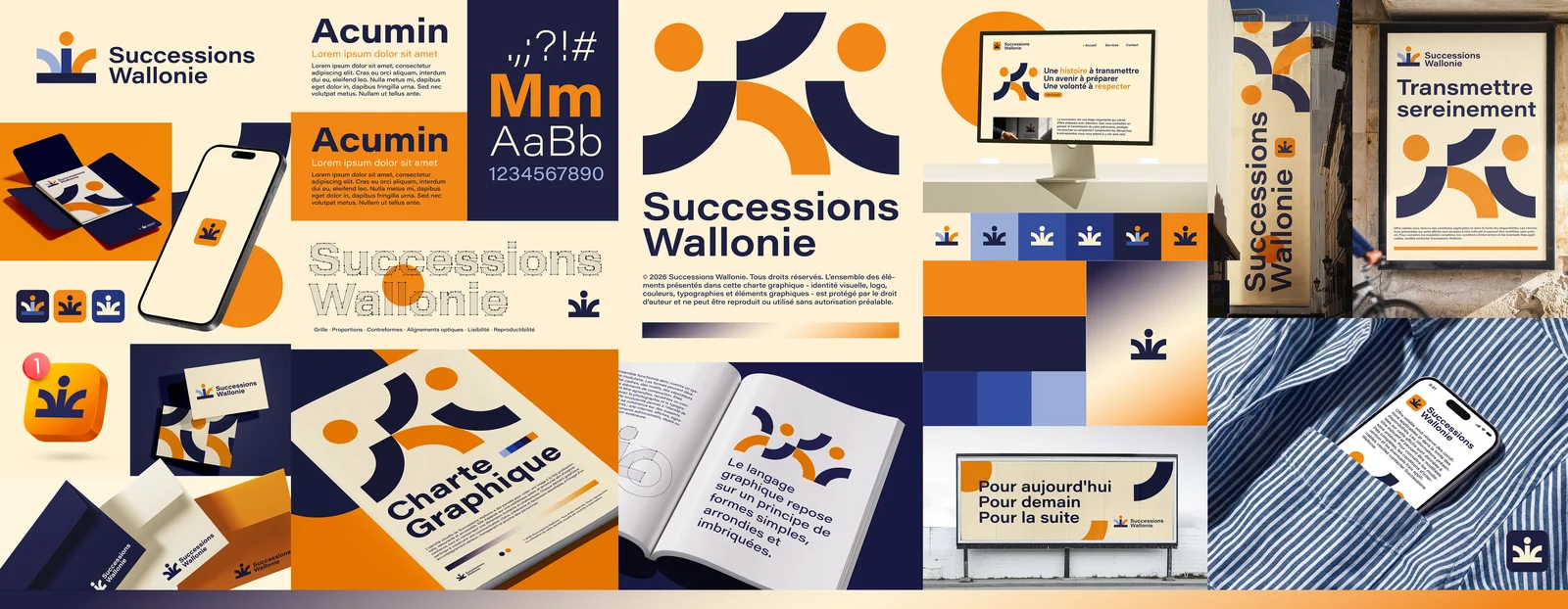
Successions Wallonie — planche d'identité visuelle

The identity board — select it to explore it at a larger scale.

A CLOSER LOOK AT THE DESIGN

Simple shapes. A shared balance.

The Successions Wallonie identity combines warm orange, deep blue and a cream background. Circular shapes and open curves form the symbol, then become modules in a wider visual language. Used alone, grouped or cropped, they give rhythm to the compositions without changing the vocabulary.

Acumin typography accompanies this geometry with sans-serif lettering. Areas of substantial text alternate with more open space, while colour reversals connect the different versions of the logo. The design reveals a system built on proportion, contrast and the repetition of a few elements.

FEATURED APPLICATIONS

One identity, from paper to screen.

The board brings together business cards, envelopes, documents and a presentation of the brand guidelines. The pattern can fill an entire surface or make room for the name and information. Versions of the symbol, alone or with the logotype, show different ways of adapting the identity to the size of each application.

Desktop and smartphone presentations extend these principles into an interface: a light background, contrasting headings and a presence of graphic shapes. In advertising, the composition focuses more on a short message and enlarged modules. These variations show the visual continuity between close-up reading and applications viewed from a distance.


LET’S TALK

An idea, a collaboration?

To discuss a creative project or find out more about my background.

Request a quote