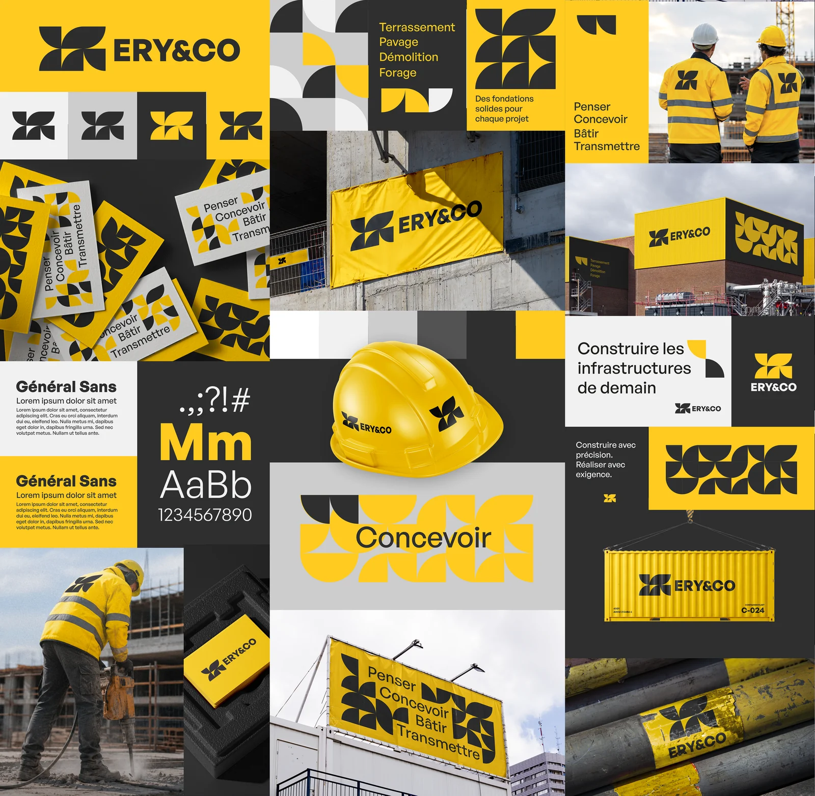
Bold yellow and black define the Ery & Co identity. A four-part geometric symbol sits alongside a compact logotype, while sans-serif lettering carries the messages. The palette stays focused; variation comes from proportions, colour reversals and the space given to the symbol.
The design follows a single principle: moving from an individual symbol to a pattern. Repeated, enlarged or cropped, the symbol becomes a surface in its own right. The compositions alternate between direct, concise messages and more expressive areas, while retaining shared reference points across applications.