PROJECT / VISUAL IDENTITY · COMMUNICATION

Ery & Co

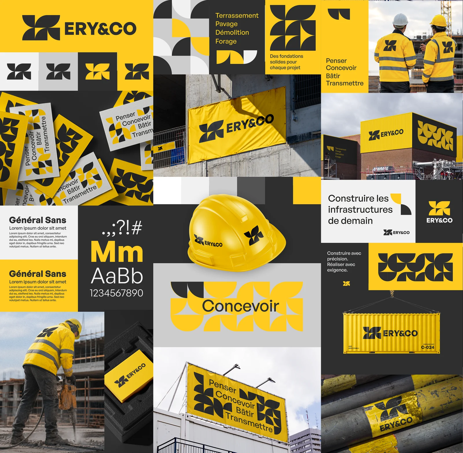
A yellow and black visual identity, developed across different applications.

Ery & Co — planche d'identité visuelle

The identity board — select it to explore it at a larger scale.

A CLOSER LOOK AT THE DESIGN

Two colours. A complete visual language.

Bold yellow and black define the Ery & Co identity. A four-part geometric symbol sits alongside a compact logotype, while sans-serif lettering carries the messages. The palette stays focused; variation comes from proportions, colour reversals and the space given to the symbol.

The design follows a single principle: moving from an individual symbol to a pattern. Repeated, enlarged or cropped, the symbol becomes a surface in its own right. The compositions alternate between direct, concise messages and more expressive areas, while retaining shared reference points across applications.

FEATURED APPLICATIONS

From small details to building façades.

The board shows this identity at several scales: building cladding, a van, site panels and banners, a container, a helmet and workwear. Cards and smaller branding details complete the presentation. The logo stands alone where space is limited; the pattern can fill a larger area where the format allows.

These applications show the continuity of a system rather than a single repeated composition. Contrast, text blocks and the rhythm of the pattern change with each format, while the palette and symbol connect the different versions.

LET’S TALK

An idea, a collaboration?

To discuss a creative project or find out more about my background.

Request a quote